Close
Van Holten’s
Art Direction, Website Design
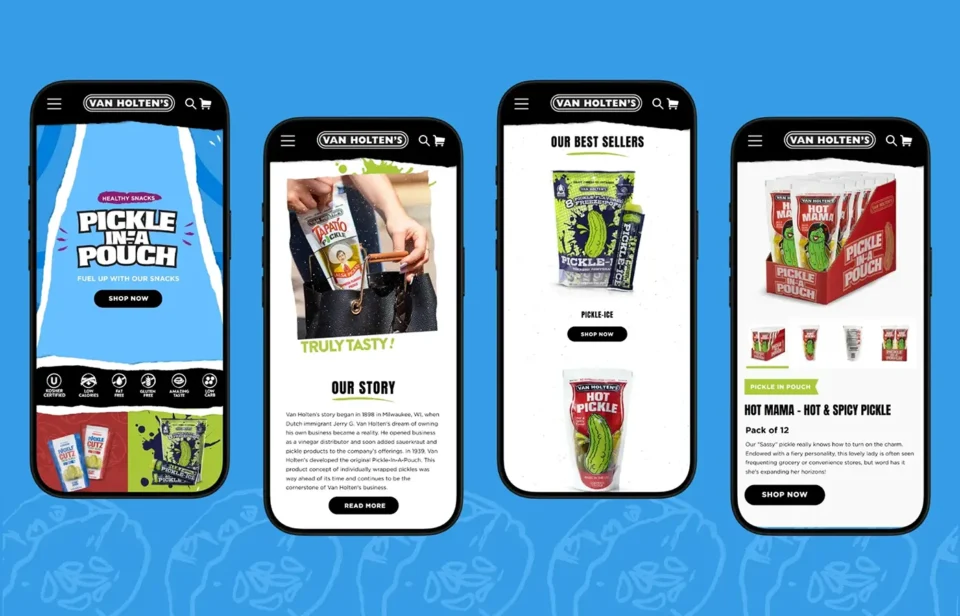
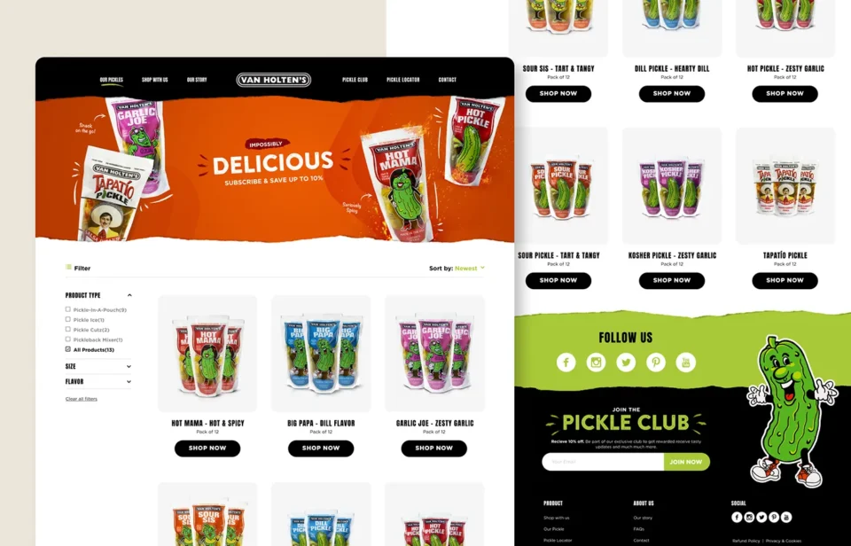
Background
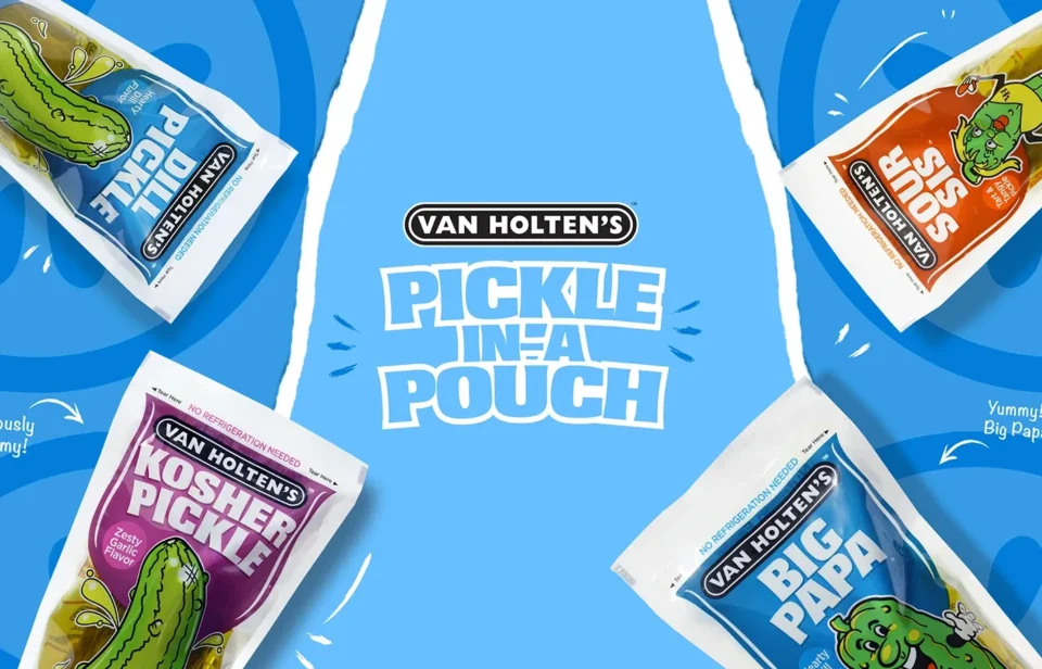
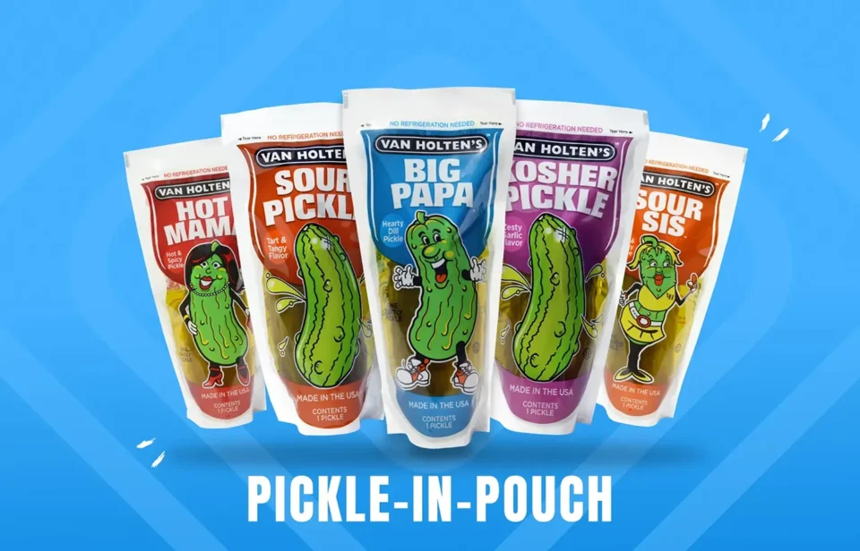
Van Holten’s has been an American icon since 1939. Their “Pickle-In-A-Pouch” is bold and beloved, but their digital presence needed a refresh to match that energy. While we didn’t develop the site ourselves, we shaped the creative direction to bring the brand’s fun, flavorful personality to life online.
What we did
-
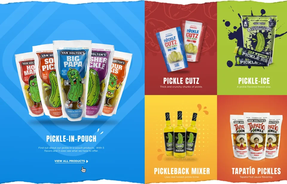
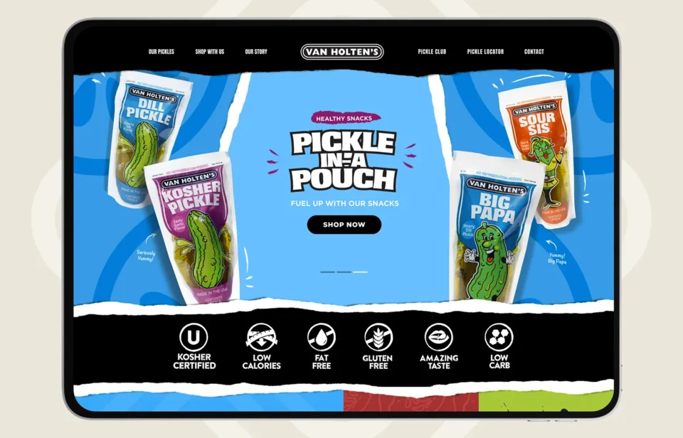
Art direction and creative guidance for the website redesign
-
Visual concepting to capture the brand’s bold identity
-
UX direction for cleaner navigation and stronger product visibility
-
Design input focused on storytelling and accessibility
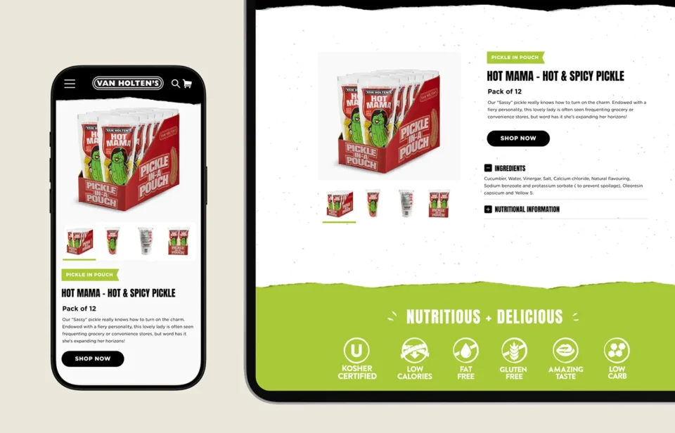
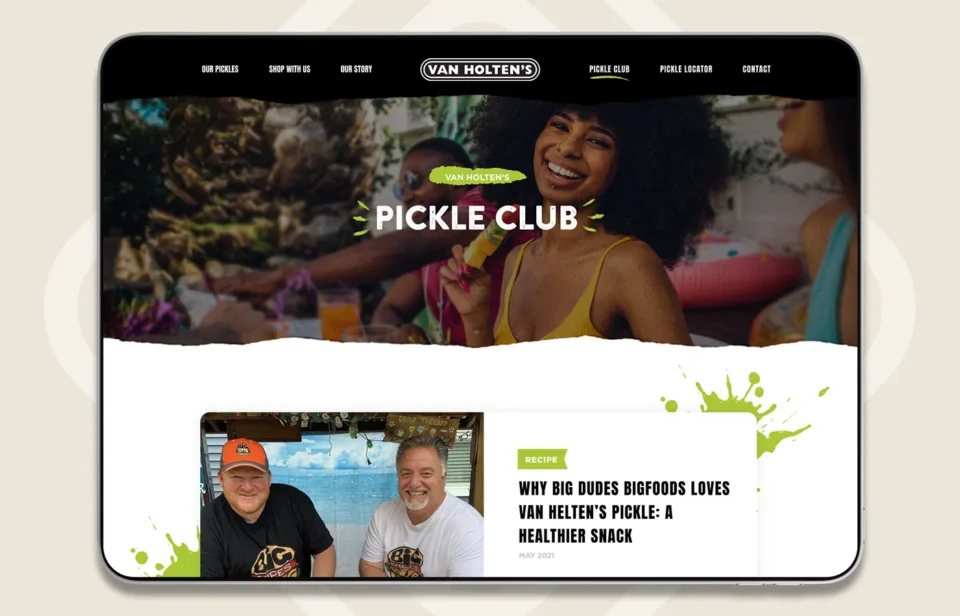
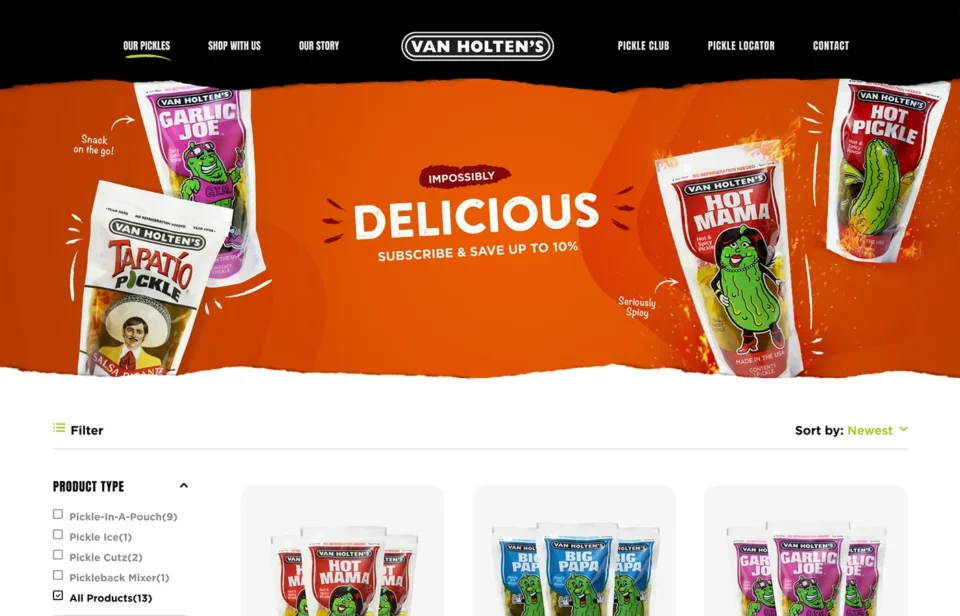
The result
The digital experience finally looks as bold as the pickles taste. It’s bright, energetic, and fun, but refined enough to support a legacy with over 80 years of history. Every element feels distinctly Van Holten’s, using punchy visuals and an intuitive layout to keep fans exploring.